|
These are key concepts and study guides for success in our program. If you forget to bring home study guides or your workbook, this page may have most of what you need to prepare for assessments. The workbook however is more detailed and the best resource for study.
If you must quarantine or be absent for more than 2 days, extended absence information is in the video here ---> |
|
Please notice that art is just 1/2 of your grade, the other 50% is made up by written work. Yes, we write in art!
Rules for art class are in the video here ---> |
| ||
| Art Project Rubric |
If you need a letter of recommendation, click the link below.
|
General Class Policies:
|
If you Participate, you will not FAIL
|
All students are expected to have some key understandings about art. These will be included on all tests, assessments, and projects. This page will act as a go-to for reference and study.
Art Elements: Line, Shape, Form, Color, Mass, Light, Space, & Texture. (Sometimes Value)
Helpful Acronym: Leonardo Saw Four Lazy Children Misuse Their Supplies
A line is a point moving through space. We can measure the length of a line and nothing else; therefore it is one dimensional or 1 -D. (A line has NO thickness or depth)
A line that intersects itself will create a shape. (Draw a scribble, wherever the line crosses itself, you have made a shape) A Shape is 2 dimensional, having just length and width but NO depth. There are 3 basic shapes. They are the Triangle, Circle and Square. A shape like a rectangle could be made from 2 squares so it is not "basic".
A shape that moves in space can create a form. Think of a coin, it is a circle, but when you flick it to spin, this shape, takes up the space of a form we call a sphere. Each basic shape can be spun or moved to create a basic form. There are 4 basic forms. They are the Cylinder, Cone, Cube and Sphere. (A pyramid is NOT a basic form because it can be made by cutting 4 planes from a cone)
There are 3 basic colors. Basic colors are also called primary colors. When these basic colors mix they create secondary colors of which there are 3. Color is reflected light. When light enters a room, your shirt absorbs all the colors within the light (a rainbow), but rejects or reflects the one color you see. KNOW the color wheel and color mixtures!!!! (There is a color wheel on the bottom right of this webpage) Some people try to remember the order of colors with the name "Roy G. Biv" The letters are the first letters of the colors starting with Red, then Orange, Yellow, Green, Blue, Indigo (a kind of blue-ish purple) and Violet.
Mass Refers to the weight of something, sometimes it is real and sometimes it is the way it looks. A dark colored box will look heavier than a light colored one. (We have all had the experience of lifting what we thought was a light object but then being surprised to find it was much heavier than expected.)
The roughness or smoothness of a surface refers to its Texture. It can sometimes be made by repeating an art element many times. For example if you draw 100 lines, they will no longer be seen as lines, but as a texture; like grass. If you place 100 small pyramids together on the floor, you will no longer see a pyramid, but only notice a rough texture. It is impossible to say how many times an element has to be repeated to make a texture, there is no exact number.
All objects, art and non-art, take up space. Many art elements move through it. This art element comes in 2 types, they are positive space, meaning where the object IS, and negative space, meaning where the object is NOT. If you think of a chair, the metal and foam that make up the chair are the positive space, but the air around it and under it are the negative space. (You exist within the negative space of your home, you live in it's empty spaces. If you were part of your home's positive space, you would be physically IN THE WALLS or floor of the building.)
The art element of light helps us see all other art elements. We see everything because it is reflected off of an object or surface and
back to our eye. When it is NOT bounced back to us we see shadow, or black or nothing. Without light we cannot see any art elements.
Art Principles: Contrast, Unity, Balance, Emphasis, Variety, Movement, Pattern. Additional concepts to remember are Motif, Asymmetry, and Symmetry.
Helpful Acronym: CUBE VaMP
Contrast: Opposites put together to create visual interest. Any art element has contrasts that can be used. Color, lines, shapes, forms… but even moods, actions and themes can be in contrast. (The happy lady is in contrast to a sad little girl) (The Warm Red balloon in contrast the cool blue water) Contrasts MUST be named in pairs.
Unity: Same-ness, Things within an artwork that make it “work” or go together well. Things may be united by any art element used a lot or repeated like line, shape, color etc… (Van Gogh’s Starry Night is Unified by his similar thick brushstrokes and also his use of mostly cool colors.) Unity helps things "go together" well, but too much unity can be boring.
Balance: There are 2 types and MUST be noted. Symmetrical (Meaning perfectly or almost perfectly mirrored) and Asymmetrical meaning in balance BUT with strong differences. When something is Asymmetrically balanced you MUST note the 2 objects that bring balance. (The flower on the right is balanced by the black space on the left) MOST paintings are balanced, you just need to be able to say "how." Balance can also be achieved by centering an object, like how portraits often have the face in the middle of the painting. They can also be balanced by having stuff all over, distributed across the whole surface, like paint splashes or a pattern that covers everything.
Emphasis: Is to focus on a certain area or object for various reasons. This is how an artist makes 1 thing more important in a painting, by visually "high-lighting" it. These reasons support the fact that the Focal Point is truly the focus. (The ball is the emphasis because everyone in the image is looking at it and pointing)
Variety: Too much of the same thing can be boring, so you need variety. Variety is not opposites like contrast, variety means having different kinds of visual interest. Varied can be in brush strokes, colors, figures, different kinds of objects, or through a variety of art elements like line, shape, color, etc... Too much variety can be bad too, so you need to find a balance between unity and variety.
Movement: Having a SENSE of movement. This can be real movement like people walking, wind blowing, rain falling etc… IT CAN ALSO be movement of your eye through the artwork as the artist intends. Shapes and lines can often “lead” your eye through an artwork. (The people run towards the finish line of the race) (The brush strokes are all horizontal making the objects appear to be blurred with speed.)
Pattern: They may be regular or irregular and you MUST say so. Trees have organic, unpredictable or irregular patterns. Checker boards are regular, predictable, mechanical, measured patterns. (The man’s shirt is covered in a predictable pattern of stripes OR The fields are overgrown with an organic pattern of weeds.) Any art element, when repeated, can create a pattern.
A "Motif" (pronounced Mow-Teef) is the smallest piece of a repeated pattern.
Color Theory Information:
Primary Colors Are: Basic colors. Red, Yellow & Blue. They cannot be made, you have to get them. No two colors will mix to make a primary color.
Secondary Colors Are: Mixtures of Primary Colors. (See the color wheel below to the right) They are Green, Orange and Purple.
Tertiary Colors: These are the colors between primary and secondary colors, like Turquoise, or Lime. Mix a primary and a secondary to make a tertiary color.
Warm Colors: All colors that might remind you of a warm fire: Reds, Yellows and oranges.
Cool Colors: All colors that might remind you of a cool beach: Greens, Blues & Purples.
Chromatic Gray: When you mix all 3 primaries, or 2 complimentary colors, you get a color that looks brown, but we call it chromatic gray. Chroma means color, so it's a gray made by mixing colors.
Analogous Colors: Colors next to each other on the color wheel. Neighboring Colors. Like Red & Orange.
Complimentary Colors: Opposite colors on the color wheel, like Red and Green.
Triadic Colors (Or Triad) : 3 equally spaced colors on the color wheel. There are infinite choices, but the 2 most common are also primary & Secondary colors.
Monochromatic: Mono= One, Chroma = Color, so together it means “Of One Color” SO if you did a whole painting with greens from light to dark, it would be monochromatic.
Black & White: Are NOT colors. They are considered Shade & Tint. Shade is to darken with black and Tint is to lighten with white.
What kinds of Colors mix “Cleanly?”
Analogous colors mix the cleanest because they are already related to each other.
What kind of Colors mix “Muddy?”
Opposite colors will always make a dark mixture that looks like brown, BUT in art we call this nasty mixture “Chromatic Gray.”
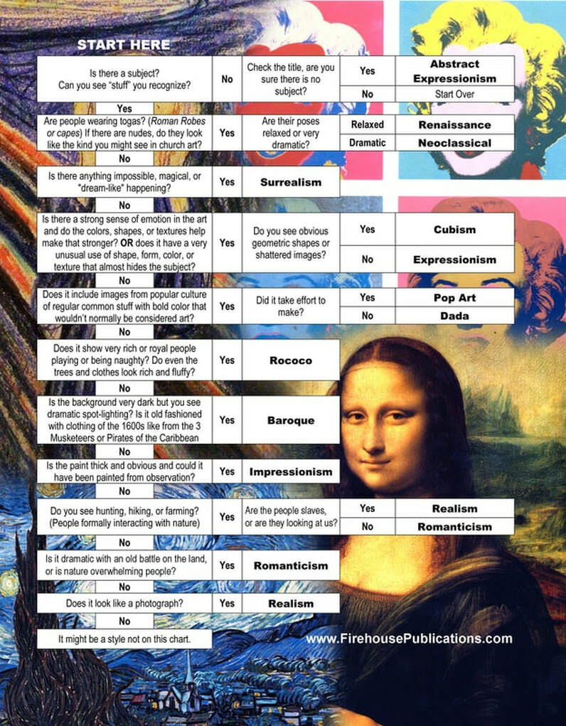
Art History Concepts: VIDEO REVIEW HERE
Schools of Art List (Some FINAL EXAM INFORMATION)
There are HUNDREDS of art movements, this is a short list of popular ones. Many schools of art can be divided into smaller schools. This is very general. Some artists like Picasso and Matisse painted in MANY different styles.
See if you can MATCH the images to the right with the School Of Art Listed Below.
(hint: They are alphabetically entered)
Renaissance – Late 1400’s, French term for “rebirth” (Rebirth of Greek & Roman Art). This work showed Greek and Roman influence, architecture, often included perspective, the newest discovery of that time. They are the oldest style we have studied. Some artists would include Leonardo Da Vinci, Michelangelo, (And the other Ninja Turtles)
Baroque – 1600's; Baroque was an art movement in response to authorities trying to control what artists could paint and not paint. The work looks like it might be on stage or dramatically lighted. Look for drama in the action or the lighting. Often has large contrasts in dark and light for more drama, but not always. People are shown in regular clothes of the time, no Greek and Roman togas. Look for clothing that might be from a "Three Musketeers" movie. Some images are from Bible themes, but NOT all.
Rococo: 1700's;
Developed in the time of French King Louis the 15th. These artists were interested in lighter elements with more curves and natural patterns. They depicted scenes that were overly sweet, everything is rosy and RICH, often with mild "naughty" play (Like a woman showing he ankle or people kissing in public) with the frivolous rich. Cute and fluffy were their main concerns. Their buildings too were covered with ornate decoration. Rococo took the drama of Baroque and topped it off with a tub of Sugar.
Neo-Classical: Late 1700's (Related to the French Revolution) A direct contrast and reaction Rococo's frivolity, the neo-classical painters were looking for a more serious artistic expression to motivate the common man. The Neo-Classists were the artists helping to bring down the Royalty and expose their selfish nature. They painted scenes of calm grandeur, always highly organized, noble. Their work looks very staged and planned, not relaxed like Renaissance art. These images often included Greek and Roman Influences so be CAUTIOUS to not confuse it with Renaissance. Nearly all buildings in Washington DC and their sculpture are the purest examples of neo-classical art and architecture.
Romanticism - in the early 1800’s, a movement in art that embraced a more dramatic, personal and emotional style. This art was in reaction to the "Age of Enlightenment" and science being seen as the new way to view the world. These artists were trying to hold onto "romantic" ideas of how they saw the world without the influences of the government and science. It usually depicted Man & Nature at a very simple level, not always peaceful. Sometimes they were on equal grounds, but sometimes nature was dominating man. (NEVER man dominating nature) The romanticists tried to paint a world before law ruled our lives.
Realism - Though this style started in the 1850's many artists still paint in this style today. Realism is the attempt to represent people, objects, or places in a realistic manner as opposed to an idealized way. Realism showed the good and the bad. A well painted image that still shows the flaws of the subject is linked to this style. Sometimes this style was used instead of a photograph, sometimes it had a deeper meaning, but always tried to paint things in a realistic way. If a painting is so realistic that it looks like a photograph, it is often called "Photo-Realism." If it is better than a photograph it might be called "hyper-realism".
Impressionism - beginning in France in the 1860's – 1880’s, a significant art movement and style of painting where artists attempted to paint their subjects in a way that showed the changing effects of natural lighting throughout the day. They didn't paint like a photography, they wanted to create an "impression" of the scene. (Hence the name impressionism.) Monet, Cassatt, Van Gogh, Cézanne, and Pissarro are members of the group of Impressionist painters. Paintings are usually THICK with paint. Images often followed a "Z" pattern to allow the viewer's eye to flow through the artwork. The name comes from Monet’s painting, “Impression Of A Sunrise.” (Technically Van Gogh is a "post-impressionist" but for our purposes we will call him an impressionist.)
Cubism - Started by Pablo Picasso in 1907 with his painting "Les Demoiselles d'Avignon." Cubism is a form of abstraction for visual and emotional effect. Images often showed more than one point of view at the same time... Images seemed shattered and re-organized. Georges Braque was a friend of Picasso who also painted in this style. Usually the subject of the art looks to be cracked apart, but you can still recognize a subject. NOT ALL GEOMETRIC WORK IS CUBISM! If you see no subject, it might be "Abstract Expressionism."
Dada - a controversial art movement begun in Germany in the 1920's in reaction to World War 1. They saw the turmoil of the time, and senseless death and thought to emulate this in their own work. Their works reflected cynicism toward social values and tradition. The artists employed unusual methods and materials in their works. It is "art of the absurd" or silly. Marcel DuChamp is famous for his “Fountain” sculpture… a toilet turned up-side-down. Dada art was sometimes meant to insult and upset people or make them look at objects in a new way. Though this school of art was very short, it helped inspire the artists of "POP Art." (Pop Art is sometimes called Neo-dada art, meaning "the new Dada.")
Expressionism: Early 1900's, during World War One, often viewed as another reaction to the horrors of war. Though the Dada artists expressed the senselessness, the Expressionists expressed their rage, anger and protest of what they saw. These artworks have recognizable images but an art element is used to express emotions. Though all art generally shows emotion, the artists of this style of art used the art elements like texture, color or shape to help enhance the emotions of the art. "The Scream" by Edvard Munch is a great example from this school of art.
Surrealism - style or movement starting in the 1920's which was influenced by psychology’s focus on dreams and the early work of Sigmund Freud, the father of Modern Psychology. Works in the Surrealist style often appear dreamlike, irrational and fantastical in their presentation. Some contributors include De Chirico, Salvador Dali, Rene Magritte and Joan Míro. They can range from images that simply look haunting or slightly “off” (though you may not know exactly why) to images that are highly real and disturbing, to images that are playful and symbolic.
Abstract Expressionism: 1930's (Though Kandinski had some works as early as 1910 in this style) YOU CAN SEE NO SUBJECT. Abstract Expressionism was concerned with the expression of emotions, ideas and thoughts through the manipulation of art elements (line, shape, color, form, etc...) Often appears to be splashed paint, or blobs of color to show emotion or some idea of the artist. A real image might be the inspiration for one of these style paintings, but that original image will no longer be evident. Some artists used NO subject to get their ideas and worked strictly from their intuition and imaginations.
Pop Art - developed in New York in the late 1950's, a style of art that derives from mass popular culture including consumer product advertising, simple every-day objects and cartoon images. It is thought to have come from some of the ideas of the Dada school of art. Pop Art is usually done with bright bold colors, simple imagery, images from popular/everyday culture and sometimes even used to criticize the culture. Some leading artists of the style include Richard Hamilton, Roy Lichtenstein and Andy Warhol.
Helpful videos:
Renaissance: https://www.youtube.com/watch?v=kzhuZmzoX5o
Baroque & Rococo Art: https://www.youtube.com/watch?v=lfRt0Y7e5Ow
Art from the 1800's: https://www.youtube.com/watch?v=XdYgyO0RmFI
Art from the 1900's: https://www.youtube.com/watch?v=DPIAVBv5iH4
Contemporary Art: https://www.youtube.com/watch?v=SgKCGwSdCMo
All Styles reviewed HERE.
| Art History Review Sheet |
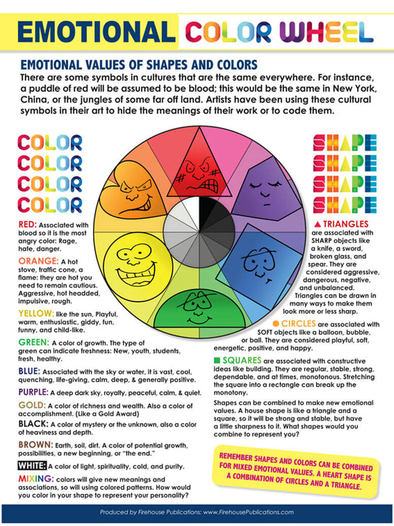
The Emotional Values of Color & Shape:
There are some symbols in cultures that are the same everywhere. For instance, a puddle of red will be assumed to be blood; this would be the same in New York, China, or the jungles of some far off land. Artists have been using these cultural symbols in their art to hide the meanings of their work or to code them. Here is a simple list. Remember shapes and colors can be combined for mixed emotional values. A heart shape is a combination of circles and a triangle.
Triangles are associated with SHARP objects like a knife, a sword, broken glass, and spear. They are considered aggressive, dangerous, negative, and unbalanced. Triangles can be drawn in many ways to make them look sharp.
Circles are associated with SOFT shapes like a balloon, bubble, or ball. They are considered playful, soft, energetic, positive, and happy.
Squares are associated with constructive ideas like building. They are regular, stable, strong, dependable, and at times, monotonous. Stretching the square into a rectangle can break up the monotony.
Red: Associated with blood, aggression, anger
Orange: Aggressive but not deadly. (Like Tackle Football)
Yellow: Playful, warm, enthusiasm, giddy and child-like
Green: A color of growth, the type of green can indicate freshness.
Blue: Associated with the sky or water, it is vast, cool, quenching, life-giving and generally positive.
Purple: A deep dark sky, peaceful, calm, and quiet
Black: A color of mystery or the unknown, also a color of heaviness and matter
Brown: Earth, soil, dirt. A color of potential growth, possibilities, a new beginning, or the end.
White: A color of light, spirituality, and purity.
MIXING colors will give new meanings and associations, so will using colored patterns.
Every semester a research paper is required. This download includes the requirements.
This can also be used as a long term assignment for students who are absent from school for more than a week.
This can also be used as a long term assignment for students who are absent from school for more than a week.
| Interview With A Dead Artist |
